
This blog post is part of a “Statistics Essentials”series of stories about the basics of statistics, and its vocabulary. To immediately receive a post when it’s out, subscribe to my Substack.
📮 Make sure you don’t miss out! Follow this blog and subscribe to an e-mail list to ensure you are among the first to get the article! Please check the rest of the website for detailed articles, cheat sheets, glossaries, and case studies.
Make sure to also download the cheat sheet based on this – click here.
In this article we will tackle basic descriptive statistics techniques – how do we calculate it manually and in R, and how can we apply it today?
INTRODUCTION
Nowadays, data analytics is a big area, ever-evolving and getting more complicated every day. Gigabytes and gigabytes of data are being collected, mostly on social media, and it seems that every so often there is a new trend or a product/service that comes out that thrives on technology advancements. Where’s technology, there’s data, and there is ever-needed data analytics.
To some, data analytics is a buzzword that they have been hearing for quite some time, but it seems that it is changing too fast, and they are losing the ropes over learning it properly and learning it well. That’s why we always have to go back to the start, to the foundations of statistics itself, and try to adapt it to nowadays achievements of technology. Luckily 2+2 is still 4, and nothing groundbreaking happened to approach the statistical methods and techniques that we use to describe data. What did change is how we use the findings and explain them, in today’s environment and changes. We still use the same formula and code to get mean, median, quartiles, minimal, and maximal values in a dataset, but how we decide to use it – is something that has changed over time.
HOW DO WE USE DESCRIPTIVE STATISTICS
To explain and present what descriptive statistics can do in layman’s terms, I’m using a dataset that is widely available to everyone on Kaggle, a data science community. The dataset is named Chocolate Bar Ratings, as food and chocolate should be a widespread, general topic, and not too specialized like some in the medical area. Perfect for an educational article, right?
This article only covers the descriptive statistics analysis, not how to load the data and clean it, before doing the analysis, if it’s needed. If you’re interested in that step, please check this article first.
Descriptive statistics consists of two main sets of measures:
- measures of central tendency – they show where the medial/middle value of the dataset lies and consists of mean, median, and mode.
- measures of variability – just showing where the middle value lies is not enough, in most cases, you also have outliers, and deviations from the middle value. Here we will compute range, variance, and standard deviation to check the spread of all data points in our dataset.
As an addition, you can only come so far by just looking at the numbers. For that, visuals like boxplots and histograms help us a lot with seeing outliers and inconsistencies with our own eyes. Along with descriptive statistics techniques, I will also perform a summary of the data.
CHOCOLATE BAR RATINGS – WHAT DO WE KNOW ABOUT IT?
The Chocolate Bar Ratings dataset consists of 1.795 observations or data points, and 9 variables, and is focused on dark chocolate. Variables are:
- company – name of the company manufacturing the bar
- specific bean origin – the specific geo-region of origin for the bar
- REF – a value linked to when the review was entered in the database, a higher number means a more recent review
- review date – date of publication of the review
- cocoa percent – cocoa percentage or darkness of the chocolate bar being reviewed
- company location – manufacturer base country
- rating – expert rating for the bar, spreads from 5 (elite) to 1 (unpleasant)
- bean type – the variety or breed of the bean used (optional)
- broad bean origin – the broad geo-region of origin of the bean
To fully explore all descriptive statistics techniques and metrics, I will start with quantitative data points in this dataset. Currently, we have several of them, but only variable Rating gives us a meaning behind it. The review date is not that important, same as REF as we are not interested in which review is the most recent one, but all reviews together and their ratings.
Once again, measures of central tendency are mean, median, and mode. Mode is almost impossible to compute for quantitative data because mode represents the value that has the highest number of occurrences in a dataset for a variable. If you have decimal numbers, it is very hard to find one single value that is repeating itself throughout the data set. We can compute a summary for the Rating of the chocolate bars and check the numbers acquainted with that variable.
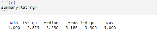
As we said earlier, the minimal value is 1, and the maximum value is 5. Median value represents a value where 50% of the data points for that variable are under that value, and 50% of the data points are above that value. In this case, it means that 50% of the ratings of the chocolate bars are below 3.25, and 50% of the ratings are above 3.25. Median is a value that is not that much affected by outliers, as much as the mean (average) value. The mean value in R is calculated by taking the sum of all the values and dividing that by the number of values in a data set (or for a variable). In this case, it means that the average rating is 3.186, which is lower than the median value. That value is indeed affected by outliers if there is any.
Imagine this example – you have the following numbers – 5, 5, 10, 5, 3, 100. The average value is 21. That is very far from what the numbers are, and it is like that because of the value of 100. If we take away the 100, which is an outlier here, then we get an average value of 5, which gives us a more real picture of the vector/values.
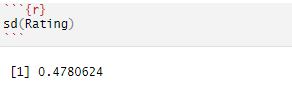
Standard deviation (SD) is a number that shows how much, on average, the variation of some random variable around its mean. In this case, the standard deviation or SD is 0.47, which means that the variation is about half of a grade/rating of the chocolate bars.
Quartiles are values about which I have not talked yet about earlier in this article. Quartiles are values that split or cut data into 4 equal pieces (quartiles). The median value is one of the quartiles, specifically, the 2nd quartile, because it splits the data in the middle (50%). The 1st quartile splits the data in 25%, aka 25% of the data falls below the value of the first quartile. Here, it means that 25% of all ratings of chocolate bars in this dataset have received a value of less than 2.875. The 3rd quartile is splitting data in 75%, meaning that 75% of the data falls below the value of the third quartile. Here, it means that 75% of all ratings of chocolate bars in this dataset have received a value less than 3.5, which can mean that only a few chocolate bars are getting the elite rating.
Again, we said that just relying on numbers, without visualizing them, is not going to take us anywhere. Let’s check out which graphs we can use for visualizing what kind of distribution is this.
GRAPH YOUR WAY INTO NUMBERS
Boxplot is the one graph we use to depict the numbers in the table under. Boxplot is a graph in the form of a box, and it puts quartiles and mean values onto it, creating a new perspective. It also takes outliers into account and shows them as well. The rating variable in this dataset can easily be shown with this simple boxplot:
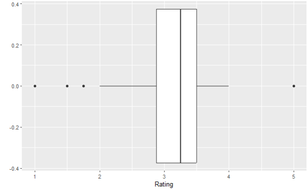
Box plot or box-and-whisker plot represents five values – all three quartiles, minimal and maximal values. That is what makes the box itself. The lines are being calculated using a 1.5 x IQR value. Interquartile value or IQR is a difference between the lower (Q1) and upper quartile (Q3).
IQR = Q3 – Q1
Do you see these horizontal lines on each side of the box? Those are called hinges, or whiskers. Whiskers are located at a distance of 1.5 x IQR and they are calculated like this:
Lower whisker = Q1 – 1,5 * IQR
Upper whisker = Q3 + 1,5 * IQR
IQR for our variable Rating is the following:
Q1 = 2.875
Q3 = 3.5
IQR = 3.5 – 2.875 = 0.625
Lower whisker = Q1 – 1,5*IQR = 2.875 – 0.625 = 2.25
Upper whisker = Q3 – 1,5*IQR = 3.5 + 0.625 = 4.125
Everything that is beyond the upper whisker or below the lower whisker is considered potential outliers, and they are annotated with the black dots on our boxplot above.
Let’s test in R how many of our Rating values are lower and higher than our lower and upper whiskers, respectively.
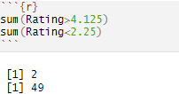
With this code, I have essentially checked which rating is lower than our lower whisker (2.25) and which rating is higher than our upper whisker (4.125), as those would be outliers. Our presumption would be, hopefully, we don’t have a lot of those values and our distribution will be too skewed. Again, in this dataset, we have a total of 1.795 observations, so we have around 2.8% of values that are considered outliers, which is not too many. In the end, true outliers would lie below and above 3 * IQR, as that is truly very far away from the usual values in a dataset.
The other way of representing these numbers is via histogram. The histogram represents how many chocolate bars got each of the ratings. Here you can see that we are dealing with some outliers, on both ends of the distribution. We already knew that outliers are present by viewing our boxplot, but for the sake of this article, we have decided to not do anything with them just yet. If you’re interested in how to clean data, please find the article on top of this one to read more about it.
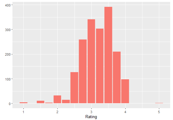
Luckily, our distribution, at least in the middle, looks a bit more normal, so we can say that the majority of the ratings were between 2 and 4, with outliers being on both sides.
When it comes to skewness, there are two values that we need to compare, if it is not already visible from the graph, which one is it? Those values are mean and median. As already mentioned in this article, if the mean is lower than the median, it means we have a dataset skewed to the left, and vice versa. That is actually what we have here – our mean Rating is lower than the median, which means that we have the distribution of the variable Rating skewed to the left (the mound is tilting a bit to the right side).
CONCLUSION
To conclude, you should use descriptive statistics as a way of summarizing and getting the first peek into the data points and the dataset that you’re dealing with. That will allow you to understand data and which further techniques and methods you can use, depending on what kind of data you have. If the first analyses using descriptive statistics show that you’re dealing with a lot of outliers, that means that you have some data cleaning to do. Later on, with the findings that descriptive statistics summaries give you, you can easily choose which technique and method you need for hypothesis testing, prediction models, regression models, and much more – which is a part of inferential statistics.
Follow this blog and subscribe to an e-mail list to ensure you are among the first to get the article!
