
This blog post is part of a “Statistics Essentials”series of stories about the basics of statistics, and its vocabulary. To immediately receive a post when it’s out, subscribe to my Substack.
📮 Make sure you don’t miss out! Follow this blog and subscribe to an e-mail list to ensure you are among the first to get the article! Please check the rest of the website for detailed articles, cheat sheets, glossaries, and case studies.
Make sure to also download the cheat sheet based on this – click here.
Normal distribution and normality are a rare event in data analytics. It happened almost never that you have a perfect mound, Gaussian distribution of a variable in a dataset. When that occurs, we are talking about outliers. Outliers are data points in a dataset that deviate from the rest of the data. In this article, we will discuss why does it happen and how to deal with it, in order to apply methods and techniques which have a normal distribution as a prerequisite.
Intro — What are outliers and why do they occur?
As we said earlier, outliers are data points that deviate from the rest of the data, mainly from the average value/mean value. They can happen for multiple reasons, such as:
a) as a result of measurement error — you would measure temperature in Celsius, and not in Fahrenheit.
b) data entry mistakes — you press 18 instead of 8.
c) natural variations in the data — while measuring height or weight, someone can definitely be higher or weight more than average.
Outlier investigation is a core part of EDA — Explorative Data Analysis process — it has to be performed, and you don’t even have to think directly about it. EDA process consists of several steps, and in each of them you indirectly or directly check for outliers, and have to keep them in mind.
Outliers — why is it important to recognize and deal with them?
When it comes to outliers, they might be naturally occurring, as we mentioned before with weight and height, or occurring because of a mistake. In both ways, we need to find ways how to recognize and deal with them, because they are not harmless. Majority of statistical methods and techniques have a “normal distribution” prerequisite, meaning that values of a variable have to be in a +/-3 standard deviations of mean value, or within 1,5 * IQR (interquartile range). Everything above 1,5 * IQR value is considered an outlier worth looking at, and everything above 3 * IQR is an extreme outlier which definitely quantifies as an outlier.
If we don’t change the outliers, there is a possibility that we will get wrong results when using advanced statistical techniques and methods, like regression modelling. When talking about simple statistics, like mean and standard deviation, they are both very dependable on outliers.
Take two simple examples:
A) You have following data points — 3,2,3,4,3,2,3,100. Number 100 is clearly an outlier here, for whatever reason, and we would like to remove it, in order to have a good distribution to continue with our statistical research. Without removing it, mean value is 15, and standard deviation of 34.
B) Let’s remove 100 from the previous vector of data points. Mean value then is 2.85, and standard deviation is 0.69.
It is clear how a simple outlier, which is much higher than the rest of the data points, can distort the numbers. In case A, we can see that neither mean or standard deviation value correspond our vector of data points. When we remove the outliers, like in case B, then we have both values corresponding to the real situation found in the vector.
How to recognize outliers in R(Studio)?
Every dataset analysis should start with EDA — Explorative Data Analysis, where you check the vitals of any variable in a dataset — mean value, standard deviation, median, quartiles, minimal and maximal value. In order to show you the code and process, I will use the Red Wine Quality dataset which you can find on Kaggle, originally from UCI ML. It consists of 11 input variables and one output variable (quality). Because of the length of the article, I will show you two variables which are different when it comes to outliers, and how to identify outliers. For the full analysis, you can visit my GitHub profile.
Every EDA starts with following code:
str(data,na.rm=TRUE) #shows us with what kind of data are we dealing with
summary(data) #shows us 6 numbers - median, mean, min, max, 1st and 3rd quartile
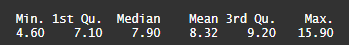
One of the variables is called fixed acidity. On photo 1, you can see how the summary of the variable looks like in R.
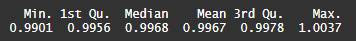
Other variable which I will show you today is called density, and on photo 2 you can see how that summary looks like.
Let’s analyze both variables and add skewness in the picture as well. On photo 1, you can see that minimal and maximal value of the variable does differentiate a lot, and there is a higher difference between median and mean values. Now this is where skewness comes in, and we can identify it, even without looking at the graphs (which we will do later).
When it comes to skewness, we are always looking at mean and median values. If the mean is higher than median, then the distribution of the variable is skewed to the right (meaning that the lower values are higher in number than higher values) and vice versa. Looking solely at the numerical, summary part, we can see that the variable fixed acidity is skewed to the right, and there is a lot of lower values, much more than higher values, and in this case those higher values might be considered outliers. On photo 2 for the density variable, you can see that almost all values are very close together, and nothing points out to be an outlier. Let’s confirm our suspicions with graphics, by using ggplot2 package in R.
There are two graphs that we will use, to identify outliers — histogram and boxplot. Histogram will show us the skewness and distribution shape, and boxplot will show us direct outliers.
Here you can see the code for the histograms:
ggplot(data,aes(x=fixed.acidity)) + geom_histogram(fill="#704264",colour="black")
ggplot(data,aes(x=density)) + geom_histogram(fill="#704264",colour="black")
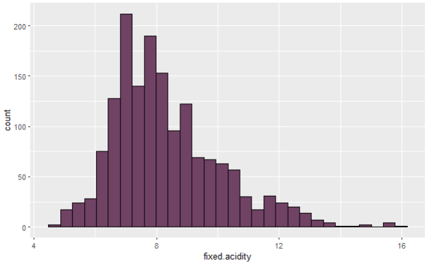

After deploying the code, you will have histograms like on photos 3 and 4 in front of you. As we were saying earlier, fixed acidity variable is skewed, and has more values on the lower end, than on the higher end, making those latter possible outlier values. On the other hand, on photo 4, you can see almost a perfect normal distribution of density variable, and this is, theoretically, how every distribution should look like, once the outlier investigation is done, and the data is prepared for further methods and techniques.
Let’s check boxplots. Boxplot consists of the following:
a) box — it is being created with mean, median, and min/max values.
b) whiskers/lines on both sides— they are Q1/Q3 (+/-) 1,5 * IQR long, everything that is longer than that is considered an outlier.
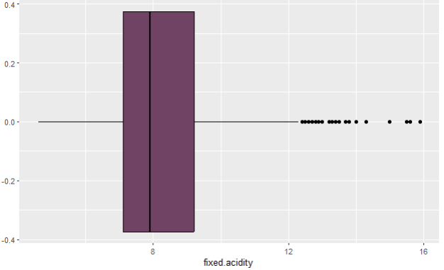
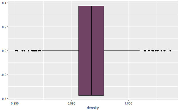
Boxplot of fixed acidity variable on photo 5 confirms that there are indeed some outliers on the higher side of the values, much higher than mean value, and they are considered extreme outliers which have to be removed. When it comes to boxplot of density variable, there are some visible outliers on both sides, but given how the histogram looks like, and the summary, I will not proceed with removing those outliers. The full picture of density variable doesn’t give me the incentive to do so, because the differences between the numbers of the summary are minimal, as shown on boxplot too (less than 0.005).
Conclusion — what can we do with outliers?
In this article you have seen two variables in the same dataset with very different distribution and outliers. Outliers will always be there, whether in a dataset or in the real world, but statistically speaking — we are interested in averaging the distribution, so we can derive a predictive model out of it, and that model will catch majority of the data values. If we leave the outliers, and do nothing with them, we will apply techniques and methods to outliers, and the model will be distorted, maybe even favoring more the higher outlier values, than the rest (90%) of normal data.
We want to avoid that, and that’s why we always have to make an outlier investigation as a part of EDA, to get ourselves familiar with the data and the whole environment in which it was created. At the end, outliers might be a produce of an innocent entry mistake in an interview or data collection which happens before the creation of the dataset. That is why it is important to know how the data points were produced, and what was the initial goal of the dataset.
After identifying the outliers, we can either stop with statistical analysis there (if we don’t plan to do something advanced with data like regression modelling) or we can perhaps decide to trim out that data out. One of the ways to do so is to use trimmed mean, aka cut out the x% of lowest values and highest values of the variable, to be left then with the middle part, and then proceed to analyze it further. That will probably leave us with less observations/data points than we started with, but it will secure our prerequisites that some of the methods and techniques have.
Make sure to read more of my articles on that topic, where I will show you directly what are some versatile ways you can make sure you are not working with a dataset containing outliers.
Follow this blog and subscribe to an e-mail list to ensure you are among the first to get the article!
