
This blog post is part of a “Statistics Essentials”series of stories about the basics of statistics, and its vocabulary. To immediately receive a post when it’s out, subscribe to my Substack.
📮 Make sure you don’t miss out! Follow this blog and subscribe to an e-mail list to ensure you are among the first to get the article! Please check the rest of the website for detailed articles, cheat sheets, glossaries, and case studies.
Make sure to also download the cheat sheet based on this – click here.
Nothing in the world is perfect, not even data. And that is what makes it beautiful and exciting. If data were perfect, then we wouldn’t have all those methods and techniques in the world of statistics and analytics, and we would always have predictable outcomes. Essentially, it would be boring. Variability in data is essential for making inferences and decisions that matter. Still, there are a lot of methods and techniques that you can apply mostly on normal/standard distributions of a variable, and not every variability in data is good. In this article, we will explore variability, and how we can approach it from a box plot perspective.

What does the variability of data represent?
When a data analyst has a data set in front of himself, they will mostly start with EDA — Explorative Data Analysis. EDA is a process of getting yourself know with data, what is the research about, with what kind of variables are you dealing with.
Essentially, it gives you a sturdy foundation for all future decisions on what to do with that data set. If you perhaps find out that all variables are nominal or descriptive, like gender, status, country, etc., then you will not use methods and techniques that need to be applied to quantitative data. If you encounter only nominal data, you can only use plots and counting in order to present the data.
Do not fall into a trap where you would replace gender, country, status, and education with numbers, to make it look like quantitative data, because that is not what that is. If you would like to classify data for yourself in that manner, you can replace the nominal data with numbers, but numbers themselves do not represent that a higher number is better than a lower number, or vice versa.
When it comes to variability on a boxplot, quantitative data is ideal to work with, as it is seen through the following aspects:
- data spread (range) — compare minimal and maximal value of the variable. The other side of it is called IQR — interquartile range, which is the difference between the first and third quartile. It indicates where does the 50% of the data sit. Naturally, if IQR is high, it indicates that the data is spread.
- outliers — in a boxplot setting, outliers are shown as little black dots after the whisker’s length, and those are all the values that are higher than the 1,5*IQR value. Those values need to be checked to evaluate their “outliers”, because the extreme/true outliers often lie after the 3*IQR value.
- symmetry and skewness — if the distribution we are seeing is not skewed (have tails), we call it symmetric/normal/standard deviation. It has the shape of a mound, and it is often called Gaussian distribution. In that case, you might have 1–2 values that might be considered as an outlier in some way, but it doesn’t affect the data set so much that you would have a distorted picture of it while using a technique or method.
All values are very close to the mean, or at least up to 3 +/- standard deviation from the mean value. On the other hand, if you do have outliers, or values beyond 3 +/- standard deviations from the mean value, that will break the mound distribution, and turn it into a distribution with either a left or right tail. A lot of nowadays statistics techniques and methods, especially regression, are sensitive to outliers, and we need to deal with them before we proceed. - comparison among groups — qualitative data doesn’t have to be bad for boxplots, just because it isn’t quantitative. It’s quite the opposite — it gives us great value and brings additional depth into the boxplot. Most of the time, we have qualitative variables like gender, country, education, etc., and those variables can be useful as a filter for the quantitative data. For example — you can create a boxplot that will compare how does a score in a math exam differentiate among gender or depending on the country where the students come from.
What does a boxplot represent?
A boxplot is also known for its other name — box-and-whisker plot, because it actually looks like that. It is one of the graphics in R which gives us a graphical show of the summary of one distribution. It displays the following features:
- median value — also known as the second quartile, and it represents the middle value
- the first quartile (Q1) — represents 25% of the lower part of the data
- third quartile (Q3) — represents 25% of the higher part of the data
- interquartile range — the difference between Q1 and Q3, and makes the box itself, as it represents the spread.
- whiskers — those are lines that extend from the box to the smallest and/or largest values within the 1,5*IQR. The smallest value is calculated as Q1–1,5*IQR, and the largest value as Q3 + 1,5*IQR.
- outliers — those are the values that are beyond the whiskers point, and need more observation and research to see if there are true outliers, and what to do with them.
Histogram is also a good option when you would like to check for outliers, but it doesn’t contain the summary, and it is not always visible if you have outliers in your data or not. Thankfully to the dots on the boxplot graphic, you can have a visible proof right away. Nevertheless, you should make boxplot a part of your graphical investigation, together with summary, histogram and scatterplots, depending on with what data are you dealing with.
Boxplot examples in R
For this representation of boxplots and how we can see variability in it, I’m going to use a dataset called Telco Customer Churn. When it comes to outliers, and their visibility on a boxplot, I recommend you to read one of my previous articles, where I have used Red Wine Quality dataset.
Telco Customer Churn is one of the IBM’s sample sets about predicting behaviour of the customers, and how can we prevent them from churning aka going away from us. In the first chapter of this article, I was writing about 4 show-and-tell signs of variability in a boxplot. Let’s take theory into practice and show what we really mean with it in R.
Starting with Telco, I am taking out the summary of Monthly Charges, and adding gender to it.
summary(MonthlyCharges)
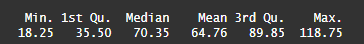
As you can see on photo 1., the difference between minimal and maximal value is large, and median value is much higher than the mean value. That will immediately tell us that this distribution is skewed, because the median and mean values are not the same or nearly the same. Since the median is higher than mean, we can, from the skewness theory point of view, talk about left skewed distribution. That means we have more of higher values than on the lower side of the distribution, aka in this case of Telco and monthly charges, we expect that people have higher montly charges, and not a lot of people have low monthly charges.
Let’s check that on a histogram, and see if that is true.

On photo 2., you can clearly see that we might have an outlier in the values from 0 to 25. It is still true that, cumulatively, we have more values between 50 to 100+, than from 0–25. We also see that females have higher monthly charges than males. So far, we have covered three of four variability aspects — comparison between groups, outliers, and skewness. Let’s check IQR, and then go straightforward to boxplot.
IQR of montly charges is 54.35. If we take into consideration Q1/Q3 +/- (1,5 -IQR) calculation to see what is the real outlier, especially on boxplot, that means that everything under -46 and 171 of monthly costs will be considered as outliers. Since that is not the case here, it doesn’t surprise that the following boxplot, on photo 3., doesn’t show any dots as outliers, as nothing qualifies.

Does that mean that there are no outliers? On histogram it is visible that a lot of clients still have monthly costs between 0 and 25, and it is up to the data analyst how to proceed with that kind of a problem. One can delete those observations, and leave the rest, probably still leaving a good amount of observations for further analysis, and your data can be clear for regression modelling, for example.
On the other hand, if a data analyst decides to leave the data as it is, they would have to perform more research whether that is a good decision, and go into A/B testing, scatter plots and other graphics/techniques which would validate that decision. The safest option would be to delete it, and then to re-do the summaries, scatter plots, histograms and boxplots, to see if the leftover observations don’t have outliers and if the distribution is close to a standard one.
When it comes to the gender vs. monthly charges on boxplot, you can see that there is almost no difference between the boxes and whiskers, even though the data on histogram would lead us somewhere else.
Conclusion
Rarely some dataset online or dataset derived from your own research will yield you a perfect distribution of the data collected. Normal world has its own outliers, and outliers don’t have to be always bad, but in order to apply statistical methods and techniques, we need to standardize data as much as possible, and deal with the variability. Only then, we can get reliable predictive models and results further on.
Every data analyst should start their statistical process with EDA, which includes graphics as well, such as histogram, scatter plots and boxplots, as all those give more and more information about data we have in front of us, and gives us strong foundation to build our decisions and be sure in our models later on.
Follow this blog and subscribe to an e-mail list to ensure you are among the first to get the article!
