
This blog post is part of a “Chartcraft”series of stories about the basics of graphics and charts in R, and its vocabulary. To immediately receive a post when it’s out, subscribe to my Substack.
📮 Make sure you don’t miss out! Follow this blog and subscribe to an e-mail list to ensure you are among the first to get the article! Please check the rest of the website for detailed articles, cheat sheets, glossaries, and case studies.
Make sure to also download the cheat sheet based on this – click here.
Data visualization is part of every data analysis and EDA (Explorative data analysis). We can’t only rely on the numbers, as we are frequently dealing with big data systems, and it is impossible to catch an outlier and abnormality with a naked eye. In R, we have few packages available to help us with data visualizations, ggplot2 being one of the most known one. But, technology isn’t everything — you need to know which graph to choose in order to present the data on a right way. In this article, we will explore different types of graphs in R and provide suggestions for when to use each of them.
Types of data and graphs
R is known for an abundance of free packages which serve from data cleaning up to neural networks, data science and clustering. One very specific package is ggplot2 — package which is filled with code that helps which graphics and presenting the data in some other way than just with numbers and summaries. As in normal, manually calculated statistics, you can’t use all types of graphs on all types of data. Few years ago, I wrote an article “Do you know your type of data?” where I presented most frequent types of data. The most frequent categorization is the following:
- quantitative data — much wider array of possibilities is available to present quantitative data in R, using ggplot2 package. The graphs that we can use are histogram, scatter plot, line plot, boxplot.
- qualitative data — data like gender, nationality, subjects in school, countries, are qualitative data, and oftentimes serve as a filter to quantitative data as well, and therefore you can group the data by qualitative variable. Qualitative data we can count, but we can’t quite perform regression analysis or similar technique as we would using quantitative data. Pie charts and bar plots are usually used for this type of data.

What can we do with ggplot2 package — how to learn it?
As said earlier, R has a whole set of packages available for almost everything that you would like to calculate or present via graphics. One of the most important and known package is ggplot2 package. It is one of the must-know package for all data analysts who plan to use R as their programming language, and there are multiple ways to immerse into it and learn its details.
When it comes to educating yourself about ggplot2 and generally about R graphics, I would highly recommend to always have the cheat sheets next to you, so it’s easier to get all the variables and options in the code. All cheat sheets are available on GitHub’s page of R (posit community), and not only for data visualization. The second way how to introduce yourself to this package and visualizations in general is to read a book called R Graphics Cookbook where every graph is explained and its code as well.
Once you’re well advanced into the coding and you feel comfortable trying something more bold, you can definitely look into someone else’s code on Kaggle, to see and figure out how to merge visualization code together.
Examples from R
In this chapter, let’s download and use some datasets from Kaggle to show you how can you present qualitative or quantitative data in R, and which code to use.
As we said earlier, qualitative data is best presented directly through counting, and shown on bar plot or pie chart. A lot of people in area of statistics and analytics do not like pie chart, as it doesn’t show anything particular, and it is sometimes deceiving with the percentages.
Data is definitely much better to be shown on bar plot. The dataset I’m using here to present the possibilities of ggplot2 package is Student’s Performance in Exams from Kaggle. It has a nice mix of qualitative and quantitative variables, so we are able to present the most important graphics in R. It is a dataset of fictional variables and results, and therefore not coming from the real world.
Let’s first see how can we present qualitative data such as lunch and parental level of education in this dataset. On photo 2, you can see the barplot of the parental level of education of the students. On photo 3, you can see how many students did have standard and reduced lunch.
ggplot(data,aes(x=parental.level.of.education,fill="#A87676")) + geom_bar()
# this is the code that generated the barplot on photo 2.

ggplot(data,aes(x=lunch,fill="#A87676")) + geom_bar()
# this is the code that generated the barplot on photo 3.
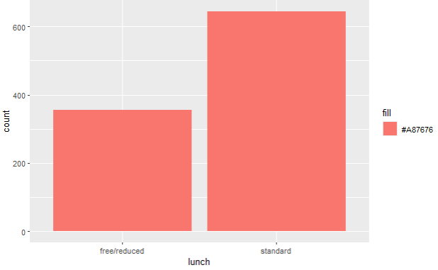
As we said earlier, you can see the count of the qualitative variables, and there is no quantitative variable included.
When it comes to quantitative data, we have more options to show off our graphics skills by using scatter plot, histogram and boxplot.
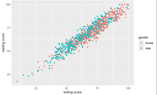
On photos 4–6, you can see scatter plots of two quantitative variables — reading and writing score. I have mentioned earlier that qualitative variables can be used as a filter or “legend” on graphs that represent quantitative data. You can see this here — we are showing a relationship between reading and writing score, but we also include a filter of gender, parental level of education and lunch options.
For example, on photo 4., you can see that female students had a bit more higher writing and reading score than male students, and on photo 6., you can see that students who ate standard lunch did have higher exam scores.
ggplot(data,aes(x=writing.score,y=reading.score,colour=gender)) + geom_point()
# this is the code that generated the scatter plot on photo 4.
ggplot(data,aes(x=writing.score,y=reading.score,colour=parental.level.of.education)) + geom_point()
# this is the code that generated the scatter plot on photo 5.
ggplot(data,aes(x=writing.score,y=reading.score,colour=lunch)) + geom_point()
# this is the code that generated the scatter plot on photo 6.


Scatter plots are usually also used for checking correlation prerequisites. You can read more about it in one of my previous articles.
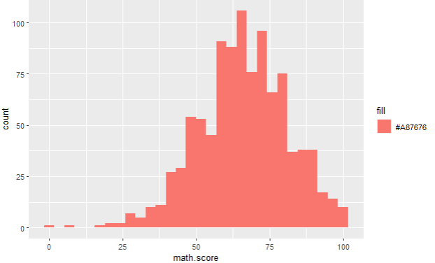
Next graph which is useful to present quantitative data is histogram. On photo 7., you can see the count of a quantitative variable math score. Once again, on photos 8 and 9, you can see that we can easily use qualitative variables to filter/legend the histogram values of a quantitative variable, and its looks turn out to be really eye opening. On photos 8 and 9, you can see what is the difference between math scores among females and males, and same for writing score. We can see that, again, females in this dataset have gotten a higher exam score in writing and math than their male colleagues.
ggplot(data,aes(x=math.score,fill="#A87676")) + geom_histogram()
# this is the code that generated histogram on photo 7.
ggplot(data,aes(x=math.score))+geom_histogram(fill="#A87676",colour="black") + facet_grid(gender ~ .)
# this is the code that generated histograms on photo 8.
ggplot(data,aes(x=writing.score))+geom_histogram(fill="#A87676",colour="black") + facet_grid(gender ~ .)
# this is the code that generated histograms on photo 9.


Conclusion
Based on all these graphs in this article, you can see that it is much easier to spot outliers, counts and general situation/relationship between qualitative and quantitative variables if you are using graphics. Especially for big data(sets), relying only on numbers and tables is not enough, because a human eye can’t spot an outlier like that, and you need to present data in a meaningful way to get forward with your analysis. At the end, it will help you get your point forward to the decision makers, once the analysis is done.
Acknowledgements
Exam Scores
Royce Kimmonsroycekimmons.com
Follow this blog and subscribe to an e-mail list to ensure you are among the first to get the article!
