
This blog post is part of a “Statistics Essentials”series of stories about the basics of statistics, and its vocabulary. To immediately receive a post when it’s out, subscribe to my Substack.
📮 Make sure you don’t miss out! Follow this blog and subscribe to an e-mail list to ensure you are among the first to get the article! Please check the rest of the website for detailed articles, cheat sheets, glossaries, and case studies.
Make sure to also download the cheat sheet based on this – click here.
When performing a statistical analysis, understanding the shape of data is important for good interpretation and further decision-making. If you fail to identify potential outliers in a dataset, all models that might come out of it might be wrong and non usable, leading to wrong results. In this article, I’m tackling the topic of skewness and kurtosis and why is it important in statistical analysis.
Measures of central tendency and their connection
The concept of skewness and kurtosis is based on measures of central tendency, and it comes from their connection to one another. Those measures are:
- Mean — also called an average value, it is the sum of all data values divided by the number of values. Since it involves all values, any high or outlier value will add to the skewness of a distribution. To minimize those effects, you can use trimmed mean. That basically removes the lowest x% and the highest x% of the dataset, but that doesn’t guarantee that the dataset won’t shift itself, and the new distribution might have new outliers that correspond to new calculation/leftover values in the distribution.
- Median — represents the middle value when data is ordered from smallest to largest. Since it’s a “positional” value, it is less affected by outliers than the mean. If your analysis shows that the distribution is skewed, and you don’t plan to do any predictive analysis on the dataset, you can use median to present the average value, as it is less distorted than the mean. In the best case scenario, present both values.
- Mode — represents the value that occurs most frequently in the dataset. One dataset can have one or more than one modes. It is not affected by outliers, and it is mostly used with categorical data (counting how many males and females there are in a group, nationality, etc.).
The connection between mean, median and mode create a measure of skewness and kurtosis of a distribution.
Skewness and its types
Skewness is a statistical measure that describes the (a)symmetry of a data distribution around its mean. Although we are mainly looking at mean, we use the connection of all three measures of central tendency.
Types of skewness are:
- Positive skewness — also called right skewed because the tail on the right side of the distribution is longer, which means that most of the values are concentrated on the left side (lower values). In this case, mean is greater than the median.
- Negative skewness — also called left skewed because the tail of the left side of the distribution is longer, and we have more concentration of high values on the right side. In this case, mean is lower than the median.
- Zero skewness — also called symmetric, and that is something we in statistics aspire to, but most of the time it is hard to achieve. In almost everything we observe in real world, there are always outliers and in some cases they are welcomed. Both tails of the distributions are equally balanced, and mean and median are equal.
On the graphs below, you can see the examples of skewness in different cases. The first case is symmetric distribution, with equal tails on both sides. The second, middle case is positive skewness, where we see a bulk of values on the lower level, but a longer tail on the right/higher side. The last, right case is the negative skewness, where we see the bulk of values on higher side, but the longer tail on the left/lower side. The case study of salaries is mostly used when explaining skewness, because in real world it is distributed like that.

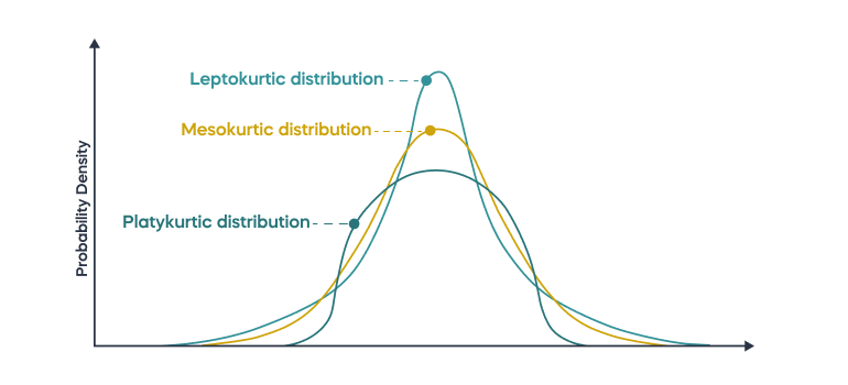
Kurtosis and its types
Kurtosis is a statistical measure that describes the shape of the distribution’s tails. This measure focuses a bit more on the outlier part of the distribution, the part which is mostly contained in the tails. It is also observing the peak of the distribution and what is its comparison to a normal distribution.
Types of kurtosis:
- mesokurtic (kurtosis = 0) — the distribution has a kurtosis similar to the one that normal/Gaussian distribution has, which means that the tails are existant, but moderate.
- leptokurtic (kurtosis > 0) — this kind of distribution has heavier tails and a sharper peak than a normal distribution would have. It gives an indication that outliers might be present. Since a higher peak means that values are concentrated around mean value, it might be valuable to use trimmed mean in this case.
- platykurtic (kurtosis < 0) — the distribution has tails, but lighter, and its peak is a bit lower than it would be with a normal distribution. That would show that distribution has some outliers in the tails, but not as extreme as leptokurtic distribution would have. Since values are “flat” and more stretched over the whole distribution, trimmed mean would probably put more emphasis on the values around the mean, but since the distribution is already flat, that would mean that the data points are spread already enough. It might also resemble uniform or multi-modal distributions.
On the picture below you can see how the density of those distributions look like.
How to calculate skewness and kurtosis in R?
By doing basic explorative data analysis (EDA), you can observe skewness and kurtosis just by seeing the summaries and graphs of the variable, such as histogram and boxplot. A while ago, I have written another article about it, so check it out to see how to observe skewness via graphs.
On the example of Telco Customer Churn (dataset found on Kaggle), I will show you how can you calculate skewness and kurtosis values, to support your summary and graphical findings even further, to make sure you will make the right decision about your data distribution.
I took variable called MonthlyCharges from the dataset in order to make this analysis. Summary (picture below) has shown that median is slightly higher than mean value for this variable, and there is a large range involved (min = 18.25; max = 118.75). It all shows towards the conclusion that the data distribution of this variable is not symmetrical, and we are interested in how skewed this distribution is.

In order to do so, you first need to install a package called “moments” in R Studio. This package will allow you access to the formula/code that you need to calculate skewness and kurtosis levels.
library(moments)
skewness_value = skewness(MonthlyCharges) #code for skewness level
kurtosis_value = kurtosis(MonthlyCharges) # code for kurtosis level
print(skewness_value)
print(kurtosis_value)
Above this text you can see the code which I have used to get my skewness and kurtosis levels. The output of this code is:
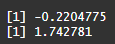
which means that our skewness level is -0.22, and kurtosis level is 1.74. That would mean that our distribution for this variable is leptokurtic and might give an indication that we have some stronger outliers involved. Skewness is negative, which shows that those outliers might be on the lower level of the distribution.
Let’s quickly check with boxplot and histogram how the distribution really looks like.
boxplot(MonthlyCharges)
hist(MonthlyCharges)

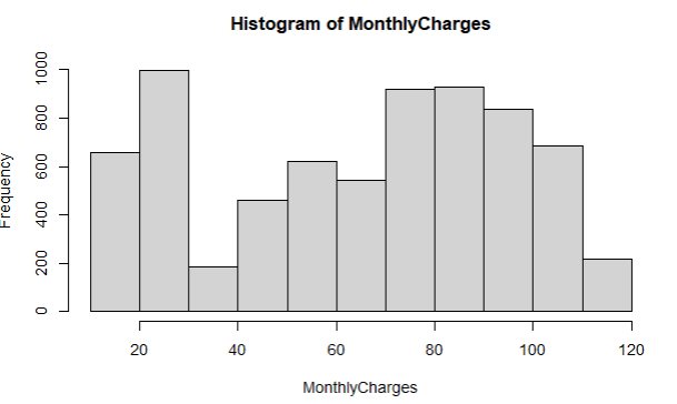
As you can see on boxplot, there are no dots showing us that some major outliers, there are still within the border of 1,5 * IQR (for more explanation what IQR is – read here). Histogram does clearly show that highest frequency is in the lower tail (lower values). In the middle values, it is visible that we are close to having a bimodal distribution, but that’s not the case.
Conclusion
Skewness and kurtosis are important parts of statistical analysis, offering insights into the asymmetry and tails of data distributions. By understanding and applying these measures, analysts can improve their assessments of data normality, model accuracy, and make their decision making better. These measures enhance the descriptive statistics, and pose as a great foundation for a good predictive model.
Follow this blog and subscribe to an e-mail list to ensure you are among the first to get the article!
