
This blog post is part of a “Statistics Essentials”series of stories about the basics of statistics, and its vocabulary. To immediately receive a post when it’s out, subscribe to my Substack.
In data analytics and statistics, it is essential to understand the distribution of the dataset, how the data was collected, and its goals. More often than not, whether you’re a junior or senior data analyst, you don’t have full information about how the data got collected, and what might be wrong with it. When you get hired into a company, you inherit the database and tracking information, and it is up to you to introduce yourself to the data, and what lies behind it. Knowing the data will make you better at performing your job, analyzing data, and giving your team and stakeholders better insights.
In this article, I will lay out the most common things you should look for in the dataset when analyzing it. This article can serve you as a go-to point, to ensure you don’t miss any important moment of your analysis, and it is written as an extensive guide with R examples.
Knowing the data will make you better at performing your job, analyzing data, and giving better insights to your team and stakeholders.
INTRODUCTION
As said in the beginning, whether you’re a junior or senior data analyst, combining all sides of the data, its collection, and what stands behind it is always hard. In most cases, you’re not pulling data just from one database/system, but from Google or Adobe Analytics, marketing tools such as HubSpot, SEMRush, and Ahrefs. Depending on your stack in the company, and how the data is organized, there is mostly one system in place to collect that additional data based on Customer ID or Product ID (for example Microsoft BigQuery system), but even then it might not be perfect.
If connecting data sources is unreliable or impossible due to complexity or budget, how do you make sense of data? What is important to evaluate in data, regardless of source or connectivity? The dashboards of the marketing systems such as Google Analytics are quite intuitive to explain, and explore and represent quite a happy spot for me. However, data in the systems that don’t give a dashboard out, so to speak, make it harder to explain and make sense of it.

Concepts to think about in this guide
- Central tendency
- Variability and dispersion
- The shape of the distribution such as skewness and kurtosis
- Outliers
- Visualizing the distribution
- Context of the distribution, data, and its collection
Case/dataset used for this analysis
Name of the dataset — [1] CBS’s (Dutch Statistics Open Data portal) data about milk supply and dairy production (specifically butter and cheese productions were chosen as variables) in the Netherlands, Europe.
Time— 1995 to 2023
Currency — in tons (1.000 kg = 1 ton)
Cheese on the shelf — Photo by Katrin Leinfellner on Unsplash
NORMAL DISTRIBUTION OR NOT? — MEASURES OF CENTRAL TENDENCY
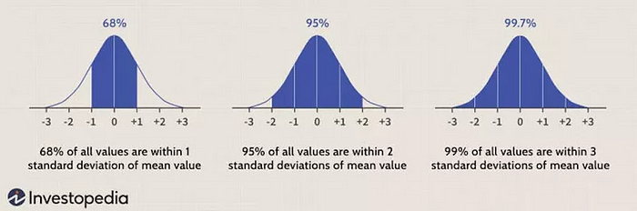
In statistics, to use most of the models and techniques, we would be happy to have a normal distribution of data, or nearly normal, as that is a very important prerequisite/requirement. It is often called the bell curve or Gaussian distribution.
Measures of central tendency show us where the center of the distribution is, and if the distribution is indeed normal, or filled with outliers.
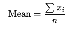
Mean or average value
The arithmetic average of the dataset is easily called “the average value”. It is the sum of all data values divided by the number of values. It involves all values, so any high or outlier value will add to the skewness of a distribution.
In a presentation case, don’t use it alone explicitly when presenting data if the distribution is skewed, but show it additionally with other measures such as the median.
How do we code it in R and how do we interpret it?
mean(variable_name)
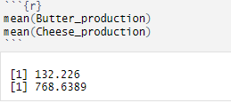
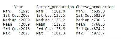
INTERPRETATION — The average weight of butter production is 132.226 tons per year, and the average weight of cheese production is 768.639 tons per year.
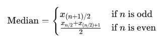
Median
The middle value once the data is ordered. It is more of a positional value, making it less affected by outliers than the mean. If your further analysis shows that your distribution is skewed, rather use median value than mean value, especially if you don’t plan to use any predictive analytics.
In the presentation case, use both values.
How do we code it in R and how do we interpret it?
median(variable_name)
INTERPRETATION — 50% of the butter production is lower than 133.156 tons, and 50% is higher than 133.156 tons. On the other hand, 50% of the cheese production is lower than 730.333 tons, and 50% is higher than 730.333 tons.
Mode
The most frequently occurring value is quite used in categorical data. One dataset can have multiple modes, and outliers do not affect this value.
It is quite useful with nominal and discrete data in a presentation case. Do not use mode with continuous data, as those values tend to be unique (decimal), and probably won’t yield a mode value.
How do we use it in R?
mode(variable_name) # in this case we didn't compute it, as we are dealing with continuous data!
HOW FAR IS THE DISTRIBUTION GOING? — MEASURES OF VARIABILITY AND DISPERSION
Once you compute your measures of central tendency — mean, median, and mode — those alone don’t tell you much about the distribution’s range or skewness. For that, we use measures of variability and dispersion.
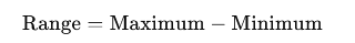
Range
Presents the difference between the largest and smallest values in a dataset. It gives you a measure of how spread out your values are, and of course, since it involves both borders, it is significantly affected by outliers. Additionally, because it only uses the border values, it doesn’t give you any information about the rest of the data points in between.
In a presentation case, there is no necessity to use or present this value, as you will mostly deal with large datasets.
How do we code it in R and how do we interpret it?
range(variable_name)
INTERPRETATION — Butter production ranges between 101.000 tons and 161.131 tons between 1995 and 2023, whereas cheese production ranges from 639.000 tons to 972.734 tons between 1995 and 2023.
Variance
The range doesn’t give us any particular information on the data between minimal and maximum values. Variance provides us with that information by giving the average value of the squared differences between each data value and the mean (squared so we mitigate the negative values).
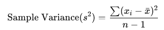
As it uses all values in a dataset, it is sensitive to outliers, even more so because we are squaring the values, so we are making the differences and the values bigger than they are.
In a presentation case, there is no necessity to use or present this value, it is better to show standard deviation.
How do we code it in R?
var(variable_name)
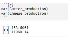
Standard deviation
With variance, we are squaring the values, making them look bigger than they are, and those values are not in the same units as the data. To do so, we square root the variance to get the standard deviation, which then measures the average distance of data values from the mean.
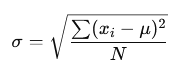
As it uses all values, it is sensitive to outliers. In a presentation case, use this value to present the spread of the data.
How do we code it in R and how do we interpret it?
sd(variable_name)
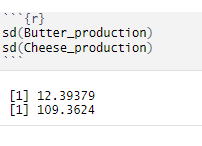
INTERPRETATION — Butter production deviates from the mean value of about 12,39 tons, and cheese production differs from the mean value of about 109,36 tons.
Interquartile range
We can use the interquartile range or IQR to gain even more insights into the middle part of the data, between minimal and maximal values. It measures the difference between the upper quartile (Q3) and lower quartile (Q1), so basically it gives us insight into the middle 50% of the data (quartiles present 25% of the data).
It is used to identify outliers, and it is a common rule that everything below Q1 — 1.5 * IQR and Q3 + 1.5 * IQR is considered outliers or at least something to pay attention to (values above 3 * IQR are an outlier).
If IQR is smaller, it can indicate that the central data points are closely packed around the median, suggesting low variability. On the other hand, a larger IQR might indicate that the central points are spread out, their range/difference is larger, suggesting higher variability. If you’re dealing with big datasets, it is quite hard to see what is small or large IQR, so other methods should be used to quantify variability.
In a presentation case, present quartile values with calculated IQR will show how the data values are scattered/ranged from 25%, 50%, and 75% (on a quartile basis).
How do we code it in R and how do we interpret it?
IQR(variable_name)
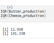
INTERPRETATION — The range between the lower 25% of the data and the upper 25% of the data for butter production is about 11 tons, whereas for cheese production that’s much higher, about 191 tons. As you can see, as we would be dealing with bigger datasets, we don’t know if 11 and 191 tons is a higher number or not, thus it makes it harder to quantify variability as such.
Coefficient of variation (CV)
CV is an additional value you don’t have to use to measure dispersion, as it is mostly used to compare variations between data series or datasets. It calculates the ratio of the standard deviation to the mean.
How do we code it in R and how do we interpret it?
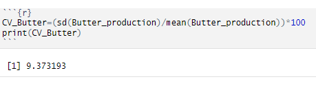
INTERPRETATION — For butter production, the standard deviation is 9,37% of its mean value. But at this moment, we are not comparing productions or different data time series.
IS THE DISTRIBUTION SKEWED? — measures of skewness and kurtosis
When put together, measures of central tendency form a relationship that shows skewness.
Skewness is a statistical measure that describes the asymmetry of a data distribution around its mean, and it uses the relationship of mean, median, and mode values.
Kurtosis on the other side is a statistical measure that describes the shape of a distribution’s tails about its overall shape, aka measures tailedness and peak height.
For more on skewness and kurtosis, check this article where I have written detailed explanations about it and put R examples.
A common rule for skewness is to observe mean, median, and mode values (in this case only mean and median values)
Mean > Median → left-skewed distribution → negative skewness → more results on the higher values side
Median > Mean → right-skewed distribution → positive skewness → more results on the lower values side
How do we use it in R?
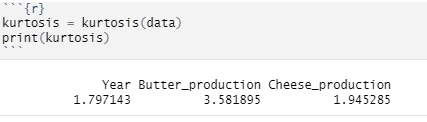
Calculate the summary of the variables by using summary(dataset_name) code in R. You will get an output like this. We are only looking at the second and third columns with production numbers. You can see that for butter production median and mean are equal, which means zero skewness (symmetric distribution). Cheese production has different mean and median values (mean is higher), which means that we have a negative skewness.
On the other hand, we have kurtosis with the following values:
Mesokurtic — kurtosis = 0 — normal distribution, tails are moderate
Leptokurtic — kurtosis > 0 — distribution with heavier tails and sharper peak than mesokurtic kurtosis, more outliers might be present as well.
Platykurtic — kurtosis < 0 — distribution with lighter tails and flatter peak than mesokurtic distribution, can indicate less outliers.
Pay attention! When analyzing real-world data, more often than not, the distribution’s look and their kurtosis level don’t fit the theory presented here.
kurtosis(variable_name)
VISUALIZING THE DISTRIBUTION
As you can see above, all those measures can be calculated in R and other statistical tools. When you have a huge dataset in front of you to analyze, observing numbers is not enough — you should visualize it and see it with your own eyes, especially for outlier detection.
By using the ggplot2 package within the R system, you can choose from a myriad of plots — bar plot, box plot, histogram, mosaic, scatter plot, etc.
Check this guide to see which graphics suits your data the best. When it comes to the outlier detection, a box plot is crucial here because it uses dots to show you which values are potential outliers, and are too far away from the rest of the distribution. Another visualization you can use is a histogram, but in R, outlier detection via this visualization highly depends on how many “boxes/bins” you decide to have in your histogram, or which values you plan to group.
How do we use it in R?
For these variables, I can use a scatter plot and box plot to show how you can visualize your dataset, and detect possible outliers.
ggplot(data,aes(x=Year,y=Butter_production)) + geom_line(fill="#088395",colour="#071952") + ggtitle("Movement of butter production in tons") + xlab("Year period") + ylab("Butter production in 000 tons") + geom_point()
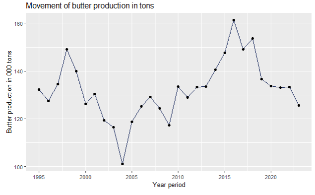
As you can see on the scatter plot, butter production had a dip in 2004, and grew almost steadily until 2016, after when it dropped again.
It is your job as an analyst to find out what is the reason for this movement for your dataset — is it campaigns, promotions, price elasticity, customers losing their loyalty to your brand, your input’s price going up, your general costs going up, etc. Use your knowledge of the business, competition, and market, to understand what is going on with your service and product.
ggplot(data,aes(x=Year,y=Cheese_production)) + geom_line(fill="#088395",colour="#071952") + ggtitle("Movement of cheese production in tons") + xlab("Year period") + ylab("Cheese production in 000 tons") + geom_point(
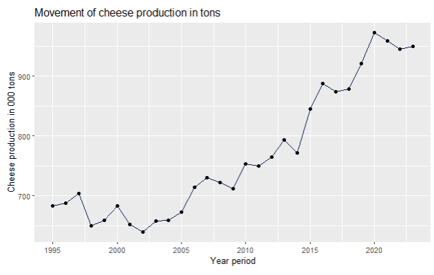
On the other hand, cheese production has been steadily going up, since 1998, when it had its lowest point, together with 2002.
library(ggplot2)
ggplot(data,aes(x=Butter_production)) + geom_boxplot(fill="#088395",colour="#071952") + ggtitle("Boxplot of butter production") + xlab("Butter production in tons")
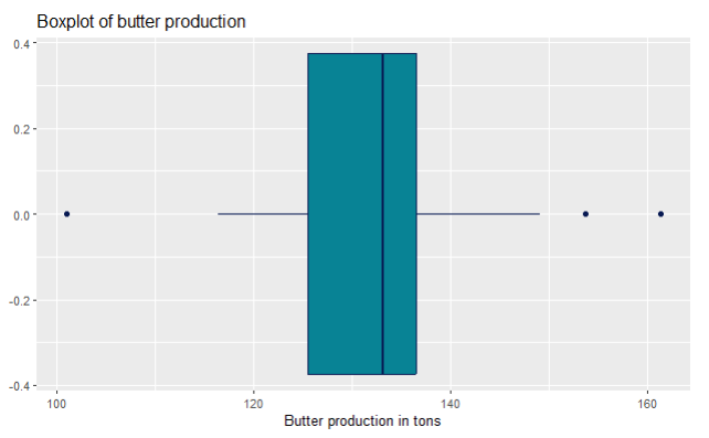
For outlier detection, we use boxplots. You can see on this butter production box plot that it has dots on both sides. That means that those values were higher or lower than Q1/Q3 +/- 1.5 * IQR, and should be explored. In the real world, it is not to be expected that a production would go up all the time.
Sometimes, over a great period of time, you might expect a normal distribution of a product over its full product cycle. Think about the profit parameter— you start small, then you start investing in promotion and marketing, getting more demand, so naturally your profits go up. With time, you might upgrade your product so the profits go up, but then you notice the saturation on the market, you introduce new products that replace the first one, competition gets harder, so the profits get less and less. It depends when do you remove that product from the market, so the profits can be higher (making the distribution not normal, because the tails are not the same), or very low (making it at the same level as when you started with selling the product, hence the tails are a big close together in sizes).
library(ggplot2)
ggplot(data,aes(x=Cheese_production)) + geom_boxplot(fill="#088395",colour="#071952") + ggtitle("Boxplot of cheese production") + xlab("Cheese production in tons")
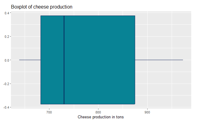
For the cheese production, you can’t see any visible outliers on the boxplot, aka there are no dots as on the previous boxplot for butter production.
OUTLIER DETECTED!? — HOW DO YOU DETECT AN OUTLIER IN YOUR DISTRIBUTION AND WHAT TO DO WITH IT?
By visualizing your data, you can easily detect an outlier. The easiest way is to draw a boxplot, and the code/graphics itself will show you dots for those data values that might be outliers. Identifying outliers is a crucial step in your analysis, because they can indicate data entry errors, and strong variability, and can be on the way to applying your methods and techniques that require non-outlier distribution (basically normal distribution, as said in the beginning of this article).
Don’t get fooled! — your data doesn’t have to be normal if it doesn’t take the normal distribution shape in the population from where you took your data in the first place.
There are some parts of the population where outliers are normal parts of it, and don’t have to be deleted or dealt with, but you have to be aware of the prerequisites/requirements of the techniques you’re planning to use on a dataset.
Nevertheless, you should ACKNOWLEDGE outliers, know from which population your data comes, and act accordingly. Deleting outliers often doesn’t solve the issue — by deleting you shrink the dataset size, the remaining values can shuffle around, and some old values tend to put themselves on the spot of the old outliers as the newly found outliers (even if we are talking about deleting one single value). Read here more about how you can detect outliers and what it looks like in R.
If you won’t use any advanced statistics techniques and methods, such as linear regression, predictive analytics, hypothesis testing, but merely using R for results/dashboarding the numbers, then it is fine to leave the outliers as it is, but once again — report them and give your own insights from the data analytics POV why are they there.
Context of the distribution, data, and its collection
As we said in the beginning of this long article, as a data analyst, sometimes you’re not sure how the data got collected, what possible statistical errors (such as bias error) stand behind it, and how much can you trust your numbers. That mostly happens when you’re a junior data analyst or just got hired in a company. It takes time for you to introduce yourself to the systems — logistics, marketing, campaigns, price, supply, and how they all work together in an ecosystem.
On the other hand, if you’re just an aspiring data analyst or learning data analytics and statistics, and you just found a dataset online, then it’s tricky to find out everything possible about the data collection, and you have to make presumptions yourself. If you download a dataset from the government open portal sites, most of the time you have a very clear data collection information, and can put together multiple datasets easily.
CONCLUSION
Understanding the details of your dataset is a fundamental aspect of successful data analysis. Whether you are working with a dataset from an open data portal or one inherited from a company system, knowing how the data was collected, its ecosystem, and potential outliers will enhance your analytical insights. By using statistical techniques such as measures of central tendency, variability, and visualization tools like box plots and scatter plots, you can identify important trends, anomalies, and key areas of focus within the data.
Ultimately, mastering these statistical essentials equips you to confidently tackle any dataset, giving your team and stakeholders a clearer understanding of the underlying data. This guide serves as a foundation, but continuous learning and practice will further solidify your expertise in data analysis. Remember, the more you familiarize yourself with the data and its context, the more accurate and impactful your insights will be.
References:
[1] Milk supply and dairy production by dairy factories, CBS Open data StatLine (2024), https://opendata.cbs.nl/statline/portal.html?_la=en&_catalog=CBS&tableId=7425eng&_theme=1139; CC BY 4.0 license
